Have you ever wondered why some colors uplift your mood while some on the other hand do the opposite or let’s just assume you are going to a place with a happy mood and all of a sudden the vibe and the color coordination of the place make you feel sad? All of this is because of color psychology.
Color plays a crucial role and is the most important part of setting up a premise aesthetics and ambiance. A colorful themed café will depict its vibrancy and happening environment. By selecting the right set of colors and color pallet for your restaurant and café furniture you can create a whole new environment and vibe that helps in welcoming the guests and making them feel comfortable on the premises and even uplift the mood when they are sad.
Impact Of Colours On Human’s Mind
Did you know different colours can evoke various feelings and reactions, this term heavily applies when we talk about interior design in café’s and restaurants. When we talk about setting up a restaurant or a café then deciding and applying the right kind of color psychology is also an important factor.
Setting up a premise with a light color theme sets a more joyful and happening kind of vibe, whereas if we set dark-themed premises it sets a more calming and relaxing vibe such as the color grey.
When opening a restaurant it’s important to consider the color combinations that should be utilized so that your restaurant is perceived welcome and boosts the appetite as well as desire to spend of your guests.
Color Psychology When It Comes To Interior Designing Of Restaurant’s And Café’s
Color is a powerful tool in interior design. It creates a certain mood or atmosphere in a space, evokes emotions and even influences behavior. The impact of color on human emotions and behavior is a fascinating and important topic for interior designers.
Warm colors such as red, orange, and yellow are associated with energy, warmth, and happiness.
Cool colors such as blue, green, and purple are associated with calm, relaxation, and serenity..
Colors can also have a physiological impact on the body. For example, blue has been shown to lower blood pressure and heart rate, while red increases appetite and stimulates the senses..
Color can also influence behavior. For example, yellow has been shown to improve attention and concentration, making it a great choice for offices and workspaces.
The impact of color on human emotions and behavior is significant and should be taken into account when designing a space. Understanding how color affects mood, emotion, and behavior can help interior designers create environments that are not only visually appealing but also emotionally impactful. By using color intentionally, interior designers can create spaces that enhance the well-being of their clients and create a more positive and welcoming atmosphere.
RED
It’s the color of love, passion, and every ’emergency’ exit sign you’ve ever panicked at, why so? Because the color red is the most vibrant color that represents emotions in their entirety.
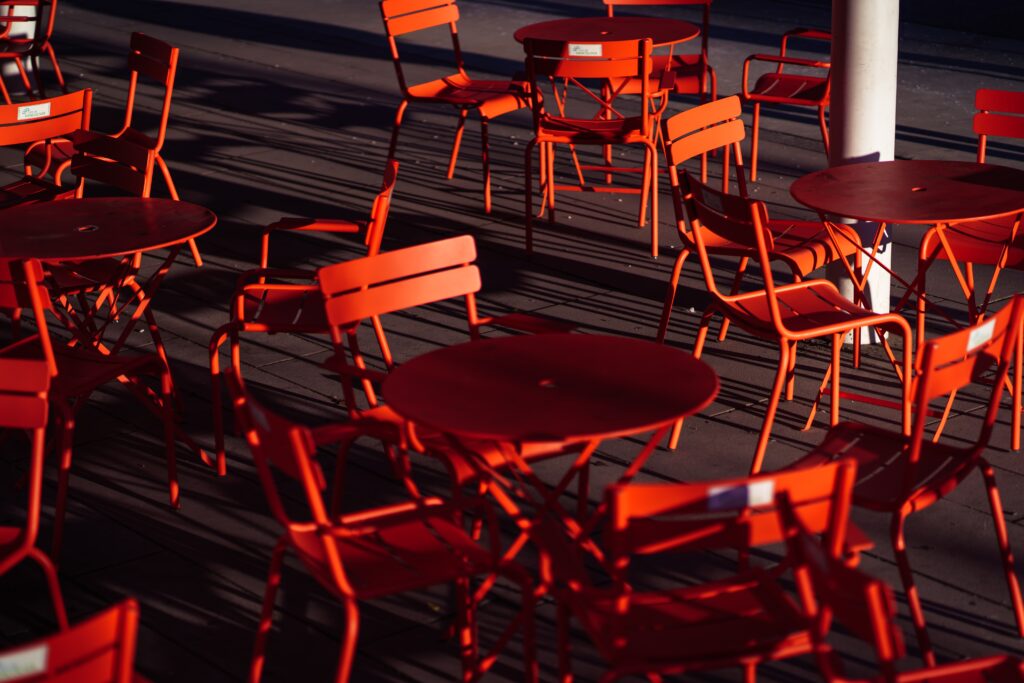
Whether it is dark shades like maroon or light shades of ham red, they create an atmosphere of love and camaraderie. Implementing the color red in your design plans adds excitement and a sense of energy to the entire surrounding. It speeds up the heart rate, increases appetite, and awakens passion and desire.
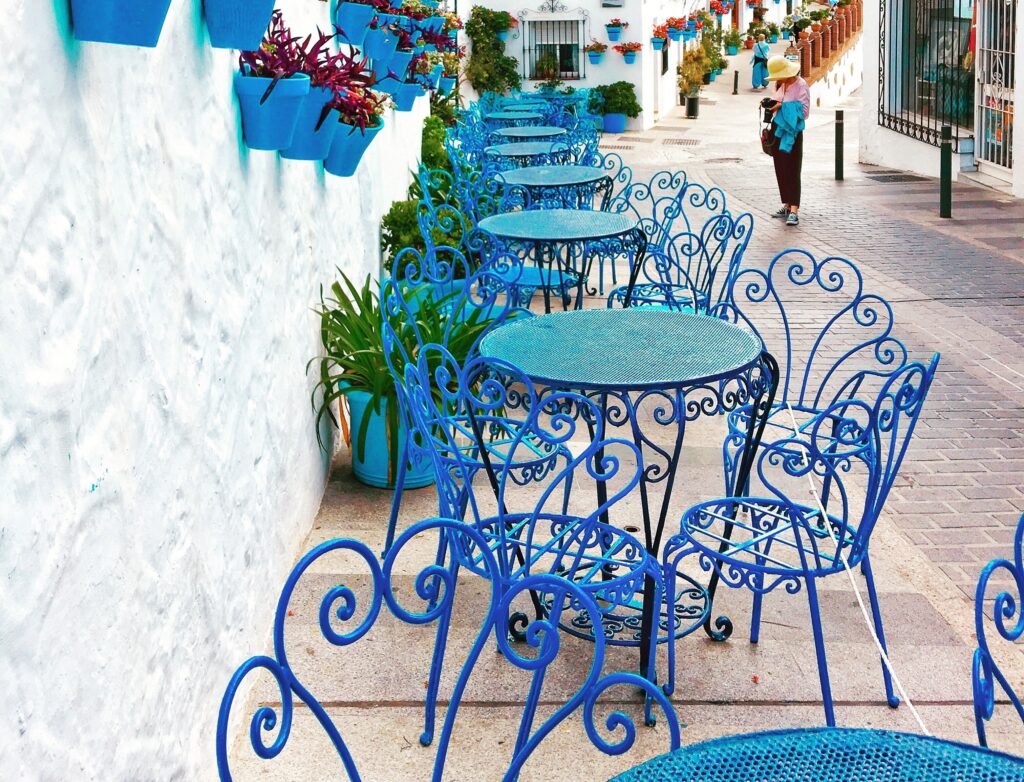
BLUE
The color of trust, security, and calmness is often used for corporates, banks, or study spaces. It’s believed to suppress appetite, so it’s not the wisest choice for café and restaurant owners to choose furniture or ambiance that is in blue color unless and until your premise is located in Greece.
YELLOW
Yellow is the most visible color in the visible spectrum and attracts anyone’s attention the fastest. In most cases, the color yellow is chosen by café and restaurant owners whose main base of audience are kids. The human brain is programmed to perceive this color first. It provokes action, but its excess can cause anxiety, nervousness, and a tendency to criticize. Yellow is great for brands aimed at children. It awakens the taste buds and stimulates the appetite.
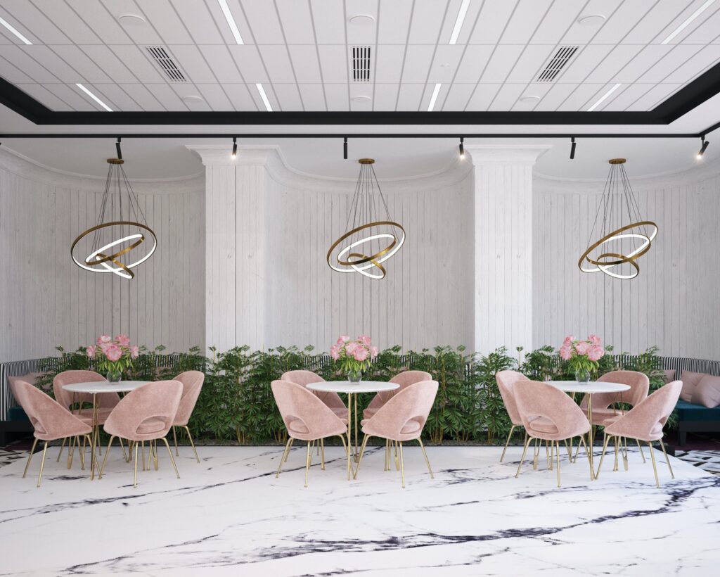
PINK
Pink is associated with feelings of warmth, friendliness, and comfort. It has a calming effect on the mind, making it an ideal choice for creating a relaxed and welcoming atmosphere for diners. As it is more on the feminine side of the table. The color pink would be a good choice if you are selling sweets, have a bakery or sell baked items or you have a feminine concept in the ambience

Theory Of Color In Different Cultures
Colour not only impacts the visual of premises but it also impacts the culture. The meaning and significance of colors vary from culture to culture and may have different opinions. These cultural differences can significantly influence the use of colors in interior design.
For example, in Western cultures, white is often associated with purity, innocence, and cleanliness. However, in many Eastern cultures, white is associated with mourning and funerals, so it is not a popular color in interior design. Red, on the other hand, is often associated with love and passion in Western cultures, while in some Eastern cultures, it is associated with luck and prosperity.
In Indian culture, bright and bold colors are often used in interior design, such as oranges, pinks, and yellows, which are associated with joy, happiness, and celebration. In contrast, in Japanese culture, muted colors, such as beige and grey, are often used in interior design to create a calm and serene atmosphere.
Understanding cultural differences in color associations is crucial to bring your brand to its full potential and connecting with customers from different cultures.
Conclusion
In hospitality furniture and interior design, it’s essential to consider the desired ambiance and the emotions you want to evoke in guests when choosing colors. A well-thought-out color palette can significantly impact the overall experience and comfort of visitors.
Hence choosing the right kind of furniture with the perfect color is a crucial part one has to go through while setting up their café and restaurant as it will affect the business in many ways and will help in welcoming the guests.
So, the next time you visit any café or restaurant, take a moment and appreciate the interior and furniture choice of the owner and the designer who has gone through each and every detail of the element to make it look fantastic and appealing.
And, I feel like you are getting confused about where to buy the perfect color matching for your place. No worries we’ve got you covered, reach out to Best Of Exports now and finalize your next perfect furniture.